802.11 Network Discovery (Wi-Fi Scanning)
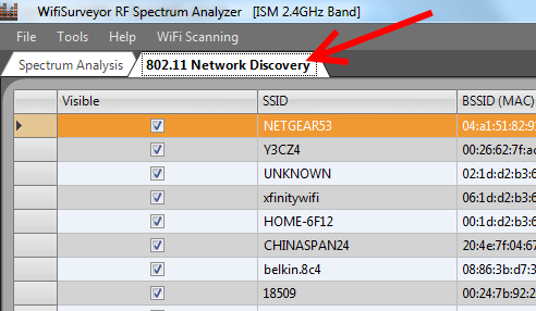
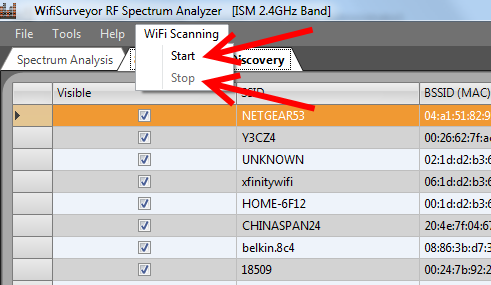
The Network Discovery charts are accessed by selecting the tab ‘802.11 Network Discovery’, and Wi-Fi scanning is toggled ON / OFF by selecting ‘Start’ or ‘Stop’ from the ‘WiFi Scanning’ drop-down menu. Please note that 802.11 Network Discovery is disabled during RF Spectrum Analysis, and vice-versa.

AP Grid View
This grid of local access points (APs) is updated in (semi) realtime — that is, scans are performed approximately once every 5 seconds.
AP Site Survey
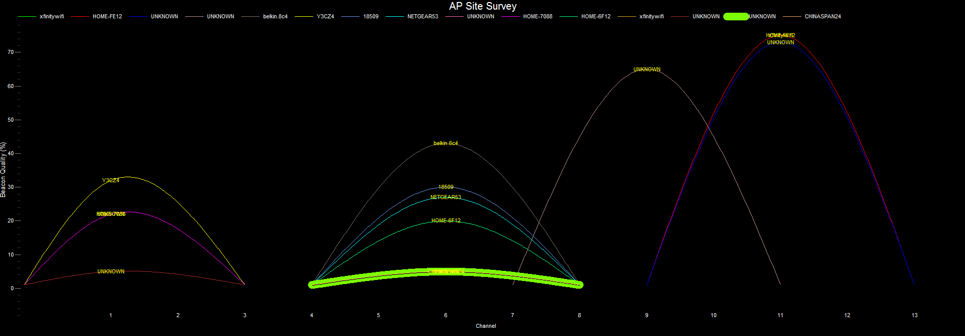
Site survey of local access points (APs). The height of each elipse reflects the strength of an AP’s beacon and NOT data throughput. The strength of an AP’s beacon is an indication of how far away the AP is located from the point of measurement.
AP Timecourse
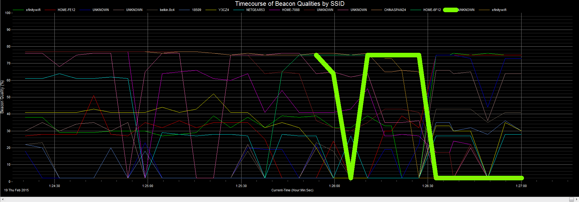
Displays the beacon strength of each access point as a function of time. The Y-axis reports the signal strength as a signal quality (0 – 100%) — where a maximum signal is assumed to be -20 dBm and the dissociation signal is -85 dBm (http://www.ces.clemson.edu/linux/dbm-rssi.shtml). We find this more intuitive than reporting a RSSI in dBm or mWatt. If you would also like to know the signal strength in dBm then this is reported in the grid above the chart.

AP Differential
Displays the current beacon strength of each access point compared with an earlier snapshot. The current beacon strength is displayed in green, the snapshot in light-blue, and the difference in gray. The Y-axis reports the signal strength as a signal quality (0 – 100%) — where a maximum signal is assumed to be -20 dBm and the dissociation signal is -85 dBm (http://www.ces.clemson.edu/linux/dbm-rssi.shtml). We find this more intuitive than reporting a RSSI in dBm or mWatt. If you would also like to know the signal strength in dBm then this is reported in the grid above the chart.
This display can be used to view small (or large) changes in beacon strength over time. Here’s how it works — when the scanning first begins then a ‘snapsot’ of the beacon strengths are taken — these are the light-blue bars. These bars are static and do not change. The green bars show the current beacon strengths, and the gray bars are the difference between the snapshots and the current beacons.
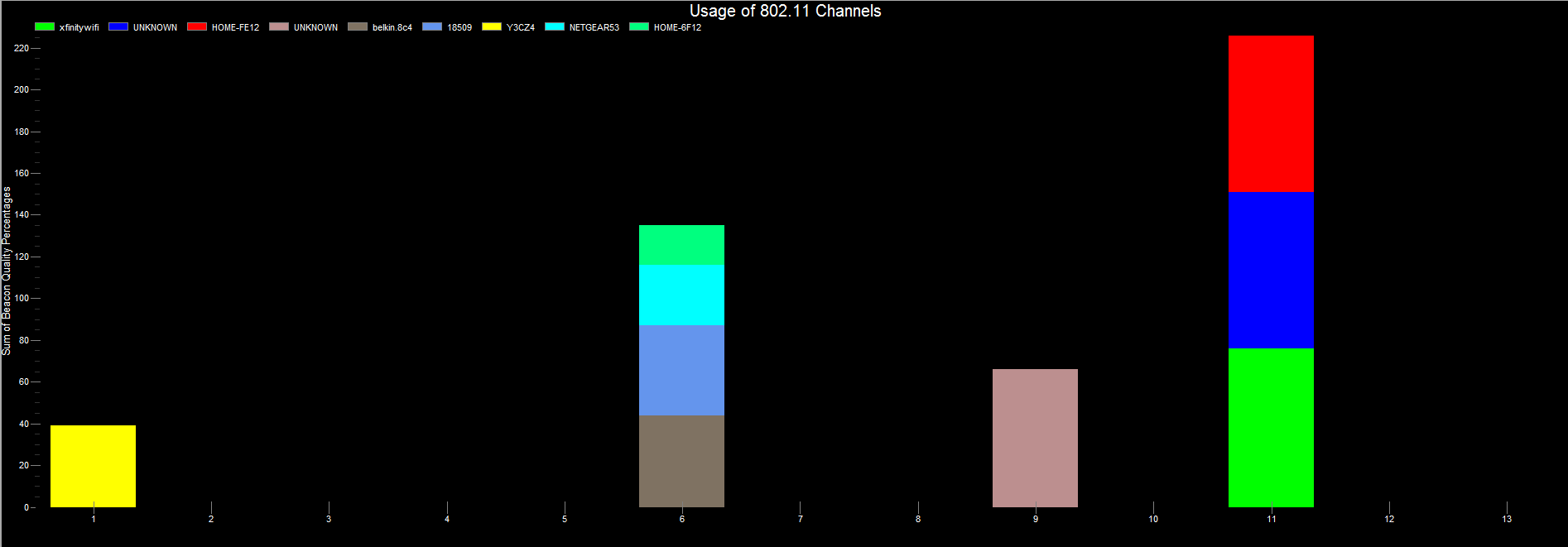
Occupied Channels
Combines the access points by channel and displays a summary of channel usage. The Y-axis reports the signal strength of beacons as a signal quality (0 – 100%). In this view the data for each channel represents a collection of access points — hence the signal quality as displayed along the Y-axis is often greater than 100%. This is because we are summing the signal qualities for each of the access points that use a particular channel. One thing important to keep in mind is that beacon signal strength is not a reflection of performance — rather, it is an indication of how close an AP is located to the point of measurement.
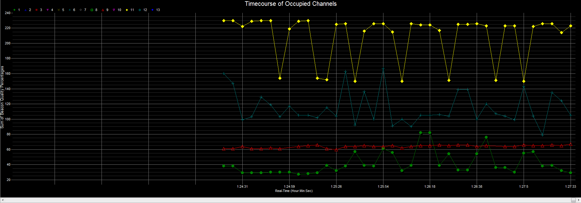
Channel Timecourse
Combines the access points by channel and displays a summary of channel usage as a function of time. The Y-axis reports the signal strength of beacons as a signal quality (0 – 100%). In this view the data for each channel represents a collection of access points — hence the signal quality as displayed along the Y-axis is often greater than 100%. This is because we are summing the signal qualities for each of the access points that use a particular channel. One thing important to keep in mind is that signal strength is not a reflection of performance — rather, it is an indication of how close an AP is located to the point of measurement.
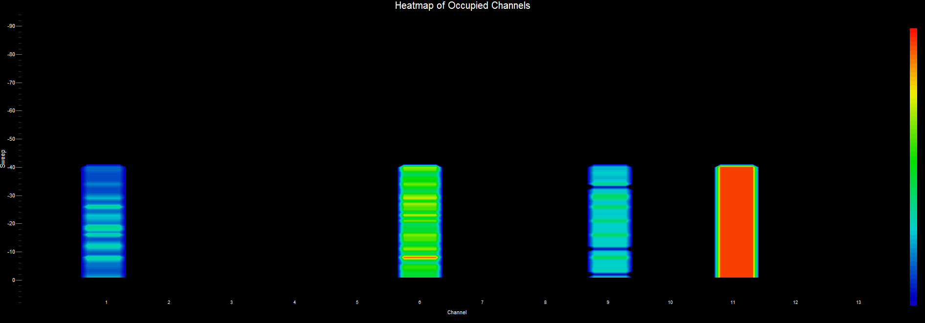
Channel Heatmap
Combines the access points by channel and displays a summary of channel usage as a Heatmap. The Heatmap chart is also known as a “waterfall” graph. It is a 3-dimensional representation of the data, where the X-axis is the channel, the Y-axis is a time scale, and the “Z-axis” is the beacon signal quality that uses a color scale. Each horizontal line in the Heatmap chart displays beacon signal strength (as a color) as a function of channel as measured over the time period of one scan. That is, with each scan (or sweep) a new row is added at the bottom of the Heatmap chart. The color legend to the right shows that stronger signals will appear red and weaker signals will appear blue.
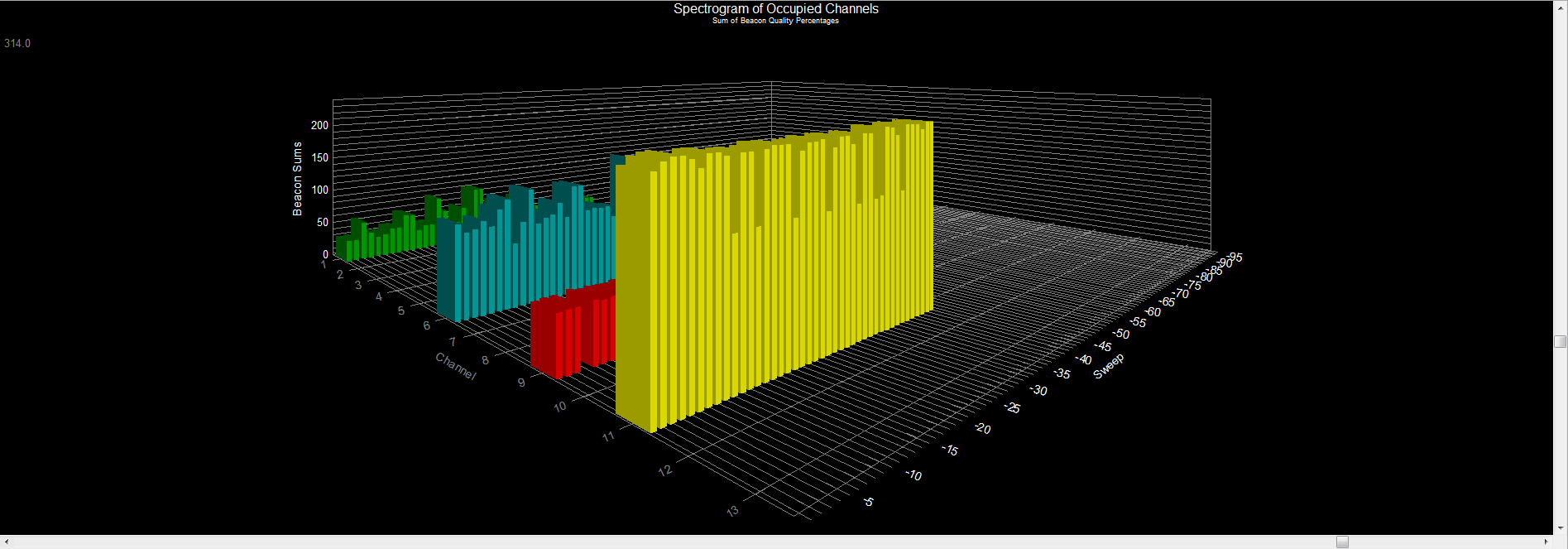
Channel Spectrogram
A three-dimensional view of channel usage as a function of time. Each channel is represented by its own set of bar graphs — the X-axis is the channel, the Z-axis is a time scale, and the Y-axis reports the signal strength of beacons as a signal quality (0 – 100%). In this view the data for each channel represents a collection of access points — hence the signal quality as displayed along the Y-axis is often greater than 100%. This is because we are summing the signal qualities for each of the access points that use a particular channel. One thing important to keep in mind is that signal strength is not a reflection of performance — rather, it is an indication of how close an AP is located to the point of measurement.
Network Discovery
8 Diagnostic Charts
AP Grid View
AP Site Survey
AP Timecourse
AP Differential
Occupied Channels
Channel Timecourse
Channel Heatmap
Channel Spectrogram
