
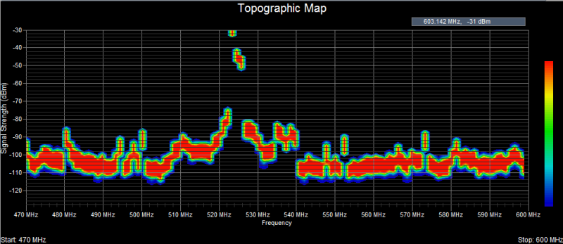
Density Chart
A three-dimensional representation of RF signal transmissions that displays accumulated RF energy as a function of frequency. The power of the signal strength in dBm is shown across the frequency span. A signal strength that appears with a relatively low occurrence is ‘blueish’ in color, whereas increasingly brighter colors are used for signal strengths that occur more frequently. Signal strengths that occur most often are ‘reddish’ in color. Another way of stating this would be to say the Topographic Map uses color to mark the rate of occurrence (i.e. how often) a particular signal strength occurs.
Over time, the Density Chart will approximate the steady-state RF energy signature of the current environment, giving the user a better, more general idea of the environment. This is because the Topographic Map de-emphasizes outliers such as intermittent or random signals while at the same time emphasizing signal transmissions that occur more frequently.
Wireless Diagnostics & Troubleshooting